
Visualizing How The White House Is Defrauding You About Precipitation
Posted: May 28, 2015 Filed under: Uncategorized Leave a commentReal Science
The National Climate Assessment uses this map, showing that heavy rainfalls have increased in the US since 1958
Heavy Downpours Increasing | National Climate Assessment
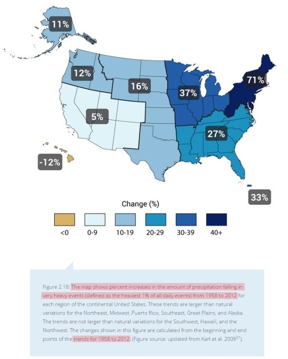
Look what they did. They picked the low point of the US record to begin their graph.
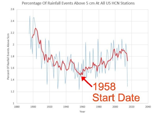
In fact, heavy rainfall events in the US are no more common than they were 100 years ago, when CO2 was close to 300 PPM. This is blatantly misleading propaganda, intended to give the reader the exactly wrong impression.
View original post

Recent Comments